得益于移动端的优势,flutter对话框种类还是比较多的,下面列举几个比较常用样式的对话框
由于gradle编译器有点抽风,所以没上图,后面搞定了再上图吧
~ 
需要准备的Scaffold组件布局如下:
Widget build(BuildContext context) {
return Scaffold(
appBar: AppBar(
title: const Text("Dialog"),
),
body: Center(
child: Column(
mainAxisAlignment: MainAxisAlignment.center,
children: <Widget>[
ElevatedButton(
onPressed: _alertDailog,
child: const Text("alert弹出框-AlertDialog"),
),
ElevatedButton(
onPressed: _simpleDialog,
child: const Text("select弹出框-SumpleDialog"),
),
ElevatedButton(
onPressed: _modalBottomSheet,
child: const Text("model弹出框-modelBottomSheet"),
),
ElevatedButton(
onPressed: _toast,
child: const Text("toast弹出框-toast"),
),
]),
),
);
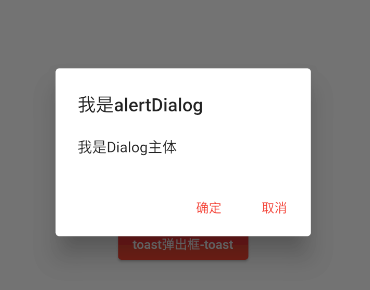
}AlertDialog(提示对话框)
提示对话框长这样:
//alertDailog(注意异步)
void _alertDailog() async {
var result = await showDialog(
context: context,
barrierDismissible: false, //不允许点击灰色背景取消
builder: (context) {
return AlertDialog(
title: const Text("我是alertDialog"),
content: Text("我是Dialog主体"),
actions: [
TextButton(
onPressed: () {
print("ok");
//关闭对话框,直接路由返回就行了
Navigator.pop(context, true);
},
child: const Text("确定")),
TextButton(
onPressed: () {
print("cancel");
Navigator.pop(context, false);
},
child: const Text("取消")),
],
);
});
print(result);
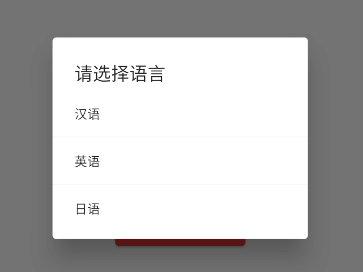
}SimpleDialog(选择对话框)
普通对话框里面是可以任意放组件的,这里可以做select的功能
void _simpleDialog() async {
    var res = await showDialog(
        context: context,
        builder: (context) {
          return SimpleDialog(
            title: const Text("请选择语言"),
            children: [
              SimpleDialogOption(
                onPressed: () {
                  Navigator.pop(context, "汉语");
                },
                child: const Text("汉语"),
              ),
              const Divider(),
              SimpleDialogOption(
                onPressed: () {
                  Navigator.pop(context, "英语");
                },
                child: const Text("英语"),
              ),
              const Divider(),
              SimpleDialogOption(
                onPressed: () {
                  Navigator.pop(context, "日语");
                },
                child: const Text("日语"),
              )
            ],
          );
        });
    print(res);
  }
showModalBottomSheet(底部弹出式模态框)
先看效果:
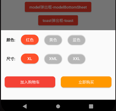
这里使用一个购物车案例演示吧:
void _modalBottomSheet() async {
var res = await showModalBottomSheet(
context: context,
builder: (context) {
return SizedBox(
height: 250,
child: Column(
children: [
Padding(
padding: const EdgeInsets.fromLTRB(20, 0, 20, 0),
child: Row(
children: [
const Padding(
padding: EdgeInsets.fromLTRB(0, 0, 10, 0),
child: Text(
"颜色:",
style: TextStyle(fontWeight: FontWeight.bold),
),
),
Padding(
padding: const EdgeInsets.all(10),
child: ElevatedButton(
onPressed: () {
Navigator.pop(context, "红色");
},
style: ButtonStyle(
backgroundColor: const MaterialStatePropertyAll(
Color.fromARGB(255, 254, 80, 42),
),
shape: MaterialStateProperty.all(
RoundedRectangleBorder(
borderRadius: BorderRadius.circular(50)),
),
),
child: const Text("红色"),
),
),
Padding(
padding: const EdgeInsets.all(10),
child: ElevatedButton(
onPressed: () {
Navigator.pop(context, "黄色");
},
style: ButtonStyle(
backgroundColor: const MaterialStatePropertyAll(
Color(0x00000ccc),
),
shape: MaterialStateProperty.all(
RoundedRectangleBorder(
borderRadius: BorderRadius.circular(50)),
),
),
child: const Text("黄色"),
),
),
Padding(
padding: const EdgeInsets.all(10),
child: ElevatedButton(
onPressed: () {
Navigator.pop(context, "蓝色");
},
style: ButtonStyle(
backgroundColor: const MaterialStatePropertyAll(
Color(0x00000ccc),
),
shape: MaterialStateProperty.all(
RoundedRectangleBorder(
borderRadius: BorderRadius.circular(50)),
),
),
child: const Text("蓝色"),
),
),
],
),
),
Padding(
padding: const EdgeInsets.fromLTRB(20, 0, 20, 0),
child: Row(
children: [
const Padding(
padding: EdgeInsets.fromLTRB(0, 0, 10, 0),
child: Text(
"尺寸:",
style: TextStyle(fontWeight: FontWeight.bold),
),
),
Padding(
padding: const EdgeInsets.all(10),
child: ElevatedButton(
onPressed: () {
Navigator.pop(context, "XL");
},
style: ButtonStyle(
backgroundColor: const MaterialStatePropertyAll(
Color.fromARGB(255, 254, 80, 42),
),
shape: MaterialStateProperty.all(
RoundedRectangleBorder(
borderRadius: BorderRadius.circular(50)),
),
),
child: const Text("XL"),
),
),
Padding(
padding: const EdgeInsets.all(10),
child: ElevatedButton(
onPressed: () {
Navigator.pop(context, "XML");
},
style: ButtonStyle(
backgroundColor: const MaterialStatePropertyAll(
Color(0x00000ccc),
),
shape: MaterialStateProperty.all(
RoundedRectangleBorder(
borderRadius: BorderRadius.circular(50)),
),
),
child: const Text("XML"),
),
),
Padding(
padding: const EdgeInsets.all(10),
child: ElevatedButton(
onPressed: () {
Navigator.pop(context, "XXL");
},
style: ButtonStyle(
backgroundColor: const MaterialStatePropertyAll(
Color(0x00000ccc),
),
shape: MaterialStateProperty.all(
RoundedRectangleBorder(
borderRadius: BorderRadius.circular(50)),
),
),
child: const Text("XXL"),
),
),
],
),
),
SizedBox(
height: 100,
child: Row(
mainAxisAlignment: MainAxisAlignment.center,
children: [
Padding(
padding: const EdgeInsets.all(10),
child: ElevatedButton(
onPressed: () {
Navigator.pop(context, "ok");
},
style: ButtonStyle(
backgroundColor: const MaterialStatePropertyAll(
Colors.red,
),
shape: MaterialStateProperty.all(
RoundedRectangleBorder(
borderRadius: BorderRadius.circular(10)),
),
),
child: const SizedBox(
width: 150,
height: 40,
child: Center(
child: Text("加入购物车"),
),
),
),
),
Padding(
padding: const EdgeInsets.all(10),
child: ElevatedButton(
onPressed: () {
Navigator.pop(context, "ok购买");
},
style: ButtonStyle(
backgroundColor: const MaterialStatePropertyAll(
Colors.orange,
),
shape: MaterialStateProperty.all(
RoundedRectangleBorder(
borderRadius: BorderRadius.circular(10)),
),
),
child: const SizedBox(
width: 150,
height: 40,
child: Center(
child: Text("立即购买"),
),
),
),
),
],
),
),
],
),
);
});
print(res);
}
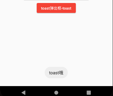
Fluttertoast(气泡消息)
注:flutter没有自带toast,需要去仓库装一个
flutter pub add fluttertoast使用toast:
 void _toast() {
    Fluttertoast.showToast(
        msg: "toast哦",
        toastLength: Toast.LENGTH_SHORT, //安卓平台有效(toast显示时长
        gravity: ToastGravity.CENTER, //方位
        timeInSecForIosWeb: 1, //提示时间 针对ios和web
        backgroundColor: Colors.red, //背景颜色
        textColor: Colors.red, //文本颜色
        fontSize: 16.0, //文本字体大小
    );
}
效果:
自定义Dailog
在Flutter中,可以通过showDialog中的builder函数来添加返回自定义Widget
//自定义Dialog
void _myDialog() async {
    var res = await showDialog(
        context: context,
        //点击灰色背景不会消失
        barrierDismissible: false,
        builder: (context) {
            //使用自定义Dailog
            return MyDailog(
                title: "kano",
                content: "kanokano.cn",
                onTap: () {
                    //异步事件
                    Navigator.pop(context, '关闭啦');
                },
            );
        });
    print(res);
}
MyDialog.dart
import 'package:flutter/material.dart';

class MyDailog extends Dialog {
  late String title;
  late String content;
  late Function()? onTap;
  MyDailog(
      {Key? key,
      required this.title,
      required this.content,
      required this.onTap})
      : super(key: key);

  @override
  Widget build(BuildContext context) {
    //Material组件可以设置背景透明,所以我们用它
    return Material(
      //设置成透明(顺便激活了点击外侧关闭对话框的功能)
      type: MaterialType.transparency,
      //点击灰色背景不会消失
      child: Center(//包裹一个Center,这样就不会造成对话框全屏覆盖了
        child: Container(
            height: 300,
            width: 300,
            padding: const EdgeInsets.all(10),
            color: Colors.white,
            child: Column(
              children: [
                Stack(
                  children: [
                    Align(
                      alignment: Alignment.topLeft,
                      child: Text(title),
                    ),
                    Align(
                      alignment: Alignment.topRight,
                      //InkWell里面有各种点击事件和交互事件
                      child: InkWell(
                        onTap: onTap,
                        child: const Icon(Icons.close),
                      ),
                    ),
                  ],
                ),
                const Divider(),
                Container(
                  padding: const EdgeInsets.all(10),
                  width: double.infinity,
                  child: Text(content),
                )
              ],
            )),
      ),
    );
  }
}